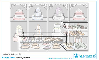
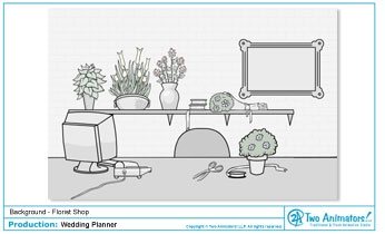
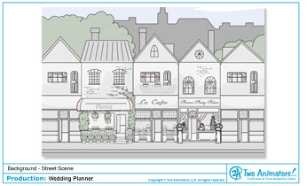
As you can see, the style of these backgrounds is a bit different than others we’ve done in the past. The client wanted a look that the characters would easily pop off of, while feeling simple and somewhat elegant at the same time. So we chose to go with a looser design, focusing on trying to capture more of a washed look to the colors… lots of whites, grays, and pastels. We played around with this to make sure the characters popped and the backgrounds weren’t too boring or bland.
Overall, I think these turned out great and definitely showcase a different style that we were able to achieve!


Copyright © Bride & Groom Planner


No comments:
Post a Comment