
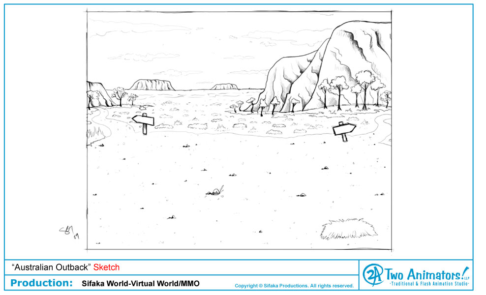
Below is my initial sketch of the Outback. When designing these areas we have to leave a good amount of space in the foreground for users to walk around, so I really wanted to accentuate the impressive monolith rock formations that the area is known for in the background. I also tried my best to split the horizon as close to the center of the screen as I could, so you can see the vast sky against the desert. I wanted to give the feeling of grandeur and sheer mass of the land.
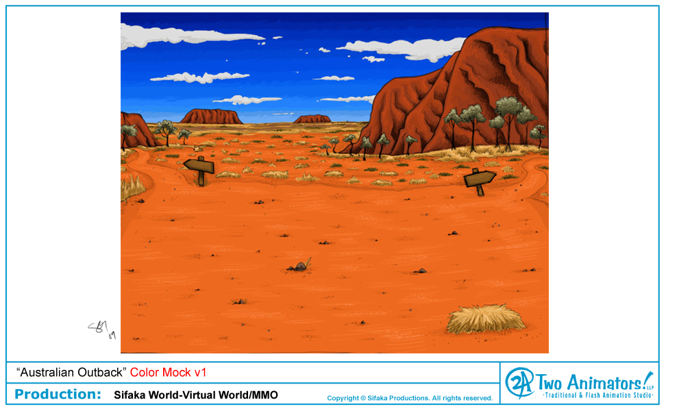
Here is the first color mock up I created. I used bright colors on the ground and rocks to highlight the orange, clay soil of the Outback. I made the sky a bright blue, which everyone liked, but felt might compete too much with the oranges of the ground and rocks.
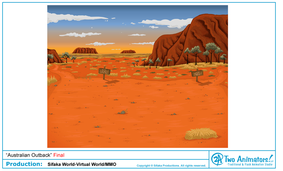
Here is the final background which incorporates some color changes, making the scene more of a sunset so that oranges and yellows help blend the colors in the sky. To my surprise, they actually balance out the bright oranges better than the blues did. I really love the feel of this new color scheme, and the client does too.
You can head down under too at www.sifakaworld.com. Just remember to send us a postcard!
Copyright © Sifaka Productions, LLC


No comments:
Post a Comment