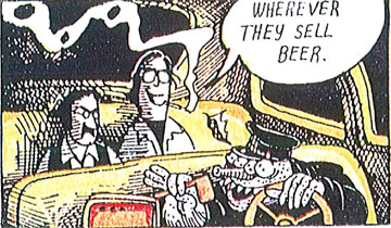
Below is a sample of what one of the original comic panels looked like.

Our challenge was to preserve the very vintage inking style and faded washes of watercolor, while allowing the characters to "pop" from the background.
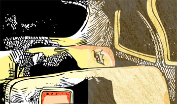
We found the solution by first painting all the individual color blocks and speckles. Then paper textures are applied on top as a partial transparency to make them look paper-soaked and old. The black ink lines are then laid on top of that to preserve the overall style of the piece. Below is a split screen example of before and after adding the paper textures.

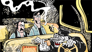
And below is a screen shot of the final translation into animation.

I feel we successfully kept the gritty ink and paint style of the comic, and made it useful for the animated piece.
You can check out the episodes now available online at Playboy.com!
Copyright © Playboy


1 comment:
I remember when you guys had, I believe, a last page cartoon in Airman magazine. I don't know why you came to mind just now, but it's great to see you're still at it. Always looked forward to your adventures!
jeffdsimon@gmail.com
Post a Comment