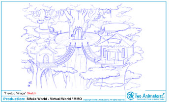
Below is the design progression for the main "Tree Top" area. First, came my intial sketch to lay the groundwork for the space. Here the basic perspective and elements are laid out.

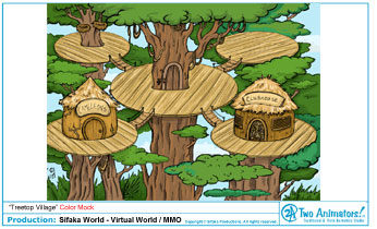
Once notes are received from the client, I move onto the color mock-up, where any revisions are made and the mood is set with color.

After another round of notes, I pass the approved color mock off for the final Flash build, where small elements such as design details are added and colors are polished. For example, we lost the dark outlines and pushed up the saturation of the colors to add to the fun, cartoon feel.

Breaking the process down into these smaller steps allows for greater flexibility during the design process, and helps mimimize time spent making larger changes later on. It also helps us achieve a fun and functional end result!
Be sure to check out this background in action at: www.sifakaworld.com
Copyright © Sifaka Productions, LLC.


No comments:
Post a Comment